torstai 27. elokuuta 2009

Another print image

Colianprint


Haven't decided yet if this is going to be another t-shirt print, but I just had to post this.

Anyway, back in the academy I didn't always realise how sloppy some of my works were, at least people seldom said too critical things out loud. A while a go my mind was blown by a quote I stopped by when I was reading Naomi Klein's No Logo (awesome book by the way). In it the anti-adverticing artist Rodriquez de Gerada commented:

MTV-sukupolvi on tottunut siihen, että kaikki on kiiltävää, puhdasta ja hohdokasta. [...] Jos uhraa aikaa näyttävyyden hiomiseen, työ ei jää huomiotta.


(Don't know the original quote, but probably something like: "The MTV Generation is used to everything beign shining, clean and glamorous. ...If you put effort into refining the work, it won't stay unnoticed.") I should have realised it earlier. Not saying the work above is a masterpiece or anything, but I'll keep trying.

tiistai 25. elokuuta 2009

T-shirt design

design
I think I outdid myself here. Rendering the model made my arms sore after hours of intense drawing, but it was fun to make this design. I was browsing the site Design by Humans and got inspired. I always wanted to combine drawings and photos so I edited out parts of the model from my photograph and changed a something spicier instead.

maanantai 24. elokuuta 2009

Randomness

Eight Eyes
Watercolor underpainting and charcoal on top. Another thing that just occurred to me in a dream that I quickly doodled before I would forget. Come to think of it, the charcoal drawing lost some of the elegant atmosphere of the sketch on the upper left corner. Perhaps I'll try again to catch that feel.

Shriptum
White oil pastel on paper + rough watercolor strokes + ink. Someone commented that the figure on the left could make a nice t-shirt design. Got to think about it.

Warm Up Drawing
I read from this one art therapy book that it is often a good idea to start the work day with a warm up drawing: "Try not to make art with it, the point is to get relaxed without feeling pressure." I think it worked rather well, I just thought "what the heck, I'll just scribble some nonsense and throw it in the garbage can." Then I got carried away and it turned into this, funny. Somebody actually liked it. Anyway, it is a cruel fact that peer pressure and competition can be very daunting in this industry, and it is sometimes difficult to start drawing because of that.

lauantai 22. elokuuta 2009

Material experimenting

solacetoagony
For a long time I've been fascinated by Enki Bilal's fine art approach on comics. This picture is a study of Bilal's style with my own take on it; an acrylic underpainting with charcoal line art on top. Still trying to find a suitable style for the comic-in-progress.

perjantai 21. elokuuta 2009

Case study: Failed World

failedworldSo, this attempt of a digital painting was recently posted on my site. While usually my ideas require a lot of planning, research and browsing through a ton of reference images, this is something that just 'popped' into my mind few months a go during a night when I was sleeping. I doodled a really quick sketch to my sketchbook (always keep one on your night-table!) before I would forget the thing.
Being still rather new to digital painting, the piece itself required some studuing on the technique. Hanging out at ConceptArt.Org forum (amazing site by the way, recommended) I found some great tutorial links at the critique center, such as these:

http://www.itchstudios.com/psg/art_tut.htm#top
http://www.itchy-animation.co.uk/light.htm
http://www.melissaclifton.com/tutorial-face.html
http://www.melissaclifton.com/tutorial-dino.html

This is one of the first color versions. With the doodle turned to 'multiply', I added a greyish blue background (I read from the Imagine FX magazine that greyish blue and dull brown are usually the best background colors when starting a digital painting). From what I have learned from others, usually it is best to start painting the image in grayscale mode, low resolution, using burn and dodge tools for highligts, but I had such a strong vision for the colors that I started painting with colors in high resolution from the start. I painted all the colors roughly to their individual layers and then just used smudge tool to achieve a more subtle control, creating a contrasting 
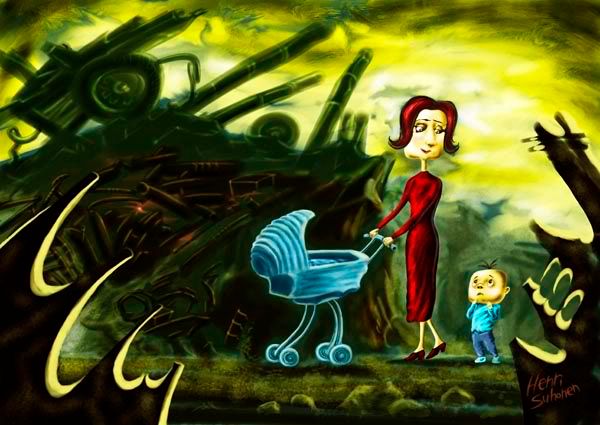
Fallout 3 meets puppet animation style piece.

However, when the image was seemingly finished, I checked the picture from other computer screens than my own. The image looked too light on any other screen. My screen has been carefully color-calibrated with i1match software and I use the recommended color profiles in Photoshop. This is a two edged sword; well-calibrated screen may produce right-looking works for the print environment, but they may not work in Internet environment because very few people use the same settings. When producing art for the web environment, all you can trust is what the Histogram says.
In this case, the image was too light because there weren't any pure blacks and pure whites as one can see from the histogram. My oil painting teacher used to tell that one should never use black to darken the colors (because black looks flat, not rich) but mix complementary colors to produce a darker color, but that does not work on digital painting. So, to make sure that the image would look good on at least most screens, I removed the marked gaps using levels panel and gave it the final pinch making an s-shape with curves panel and giving it a slight sharpening with unsharp mask filter.

sunnuntai 2. elokuuta 2009

Back again


For some reason I can't access the previous blog, so I will be using this one from now on. I was surprisingly busy during July building some stuff at the family's summer cottage, the computer screen broke down and had to be changed, which prevented me from doing any work on the computer. That's why the comic project has been delayed. I'm having fun working on a series of weird monsters. This one is a charcoal drawing which has been rendered with the smudge tool. My works have improved a lot after I learned you have to squint your eyes to check that the image has enough contrast and clarity; the point of interest should form a silhouette.